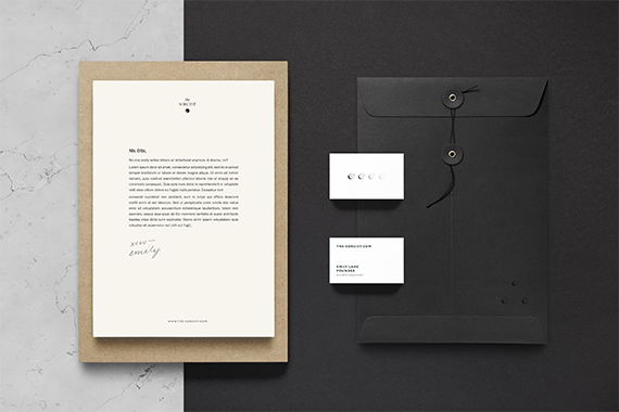

the Sorcist
Branding
Digital Style Guide
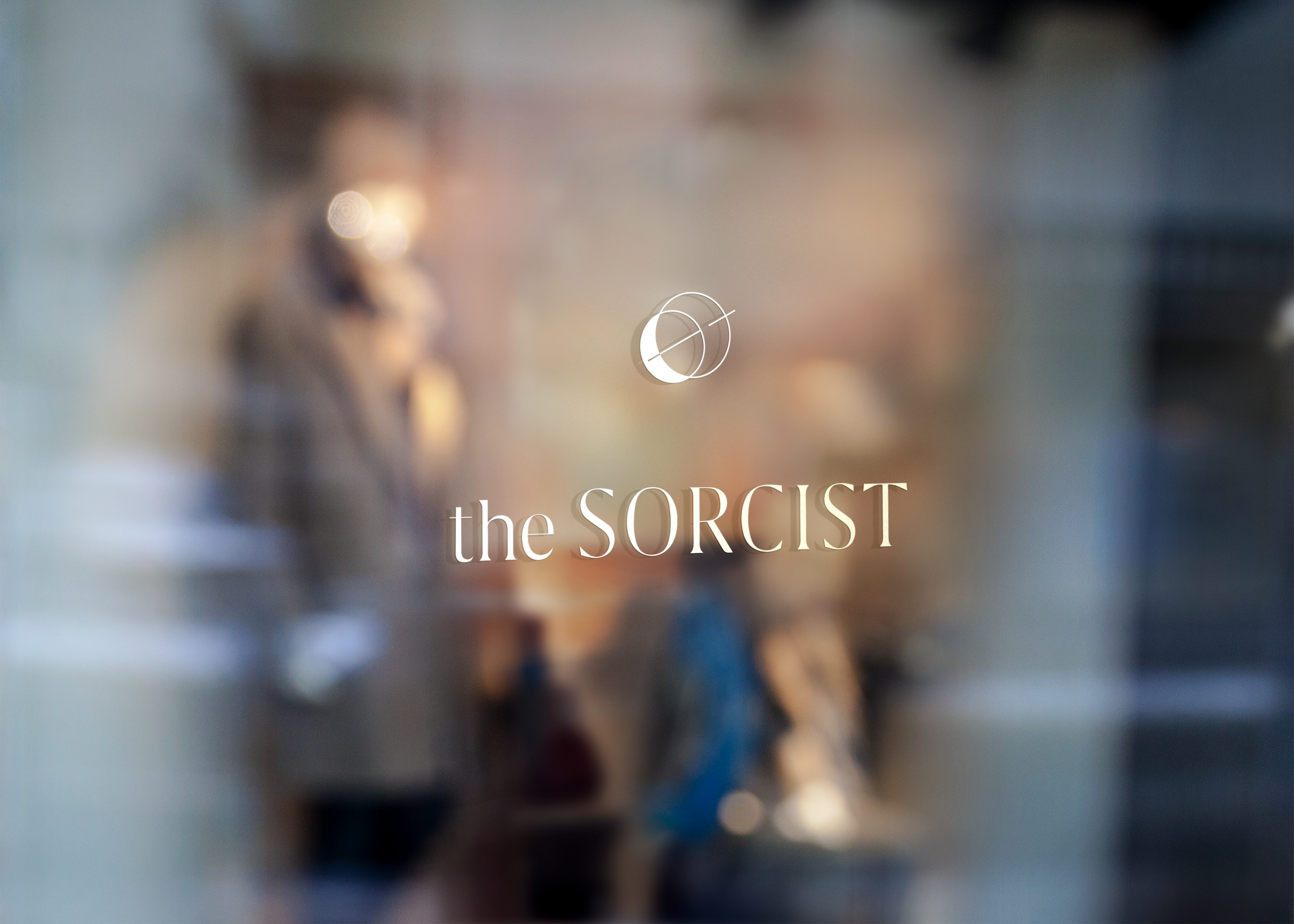
The Sorcist is an adaptogenic herbal supplement brand currently in pre-launch. I worked with the founder, Emily, to form an identity for the brand that would stand out in a market that leans heavily in two directions: clean, medical-feeling health brands, and earthy herbal brands. We wanted to take this product into a space that would feel crisp and well thought-out, but retain a bit of mysticism.
The mark utilizes geometric shapes to invoke the forms of sun, moon, and planet – the building blocks of our solar system – and joins them with a piercing vector, a symbol of continuity and motion. In this way the mark represents the balance of mysticism and science that is central to the Sorcist ethos.
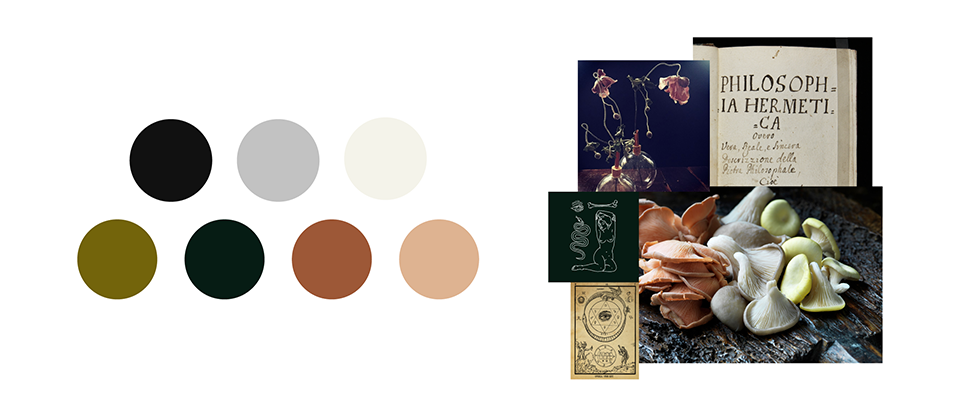
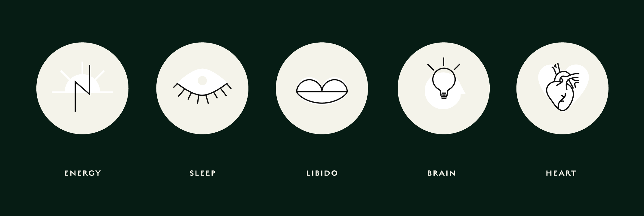
COLOR
Off-white and not-quite-black reminiscent of parchment and ink, accent colors invoking moss and fungus and flora.

More Projects