Emma Holder
About

Overview
About Life House
Life House is a chain of boutique hotels and a technology solution for hotel management. The brand is now operated by Lark Hotels.
My role
I was responsible for leading the design of both guest-facing products like the booking site and check-in kiosks, as well as back of house management tools to support them.
The goal
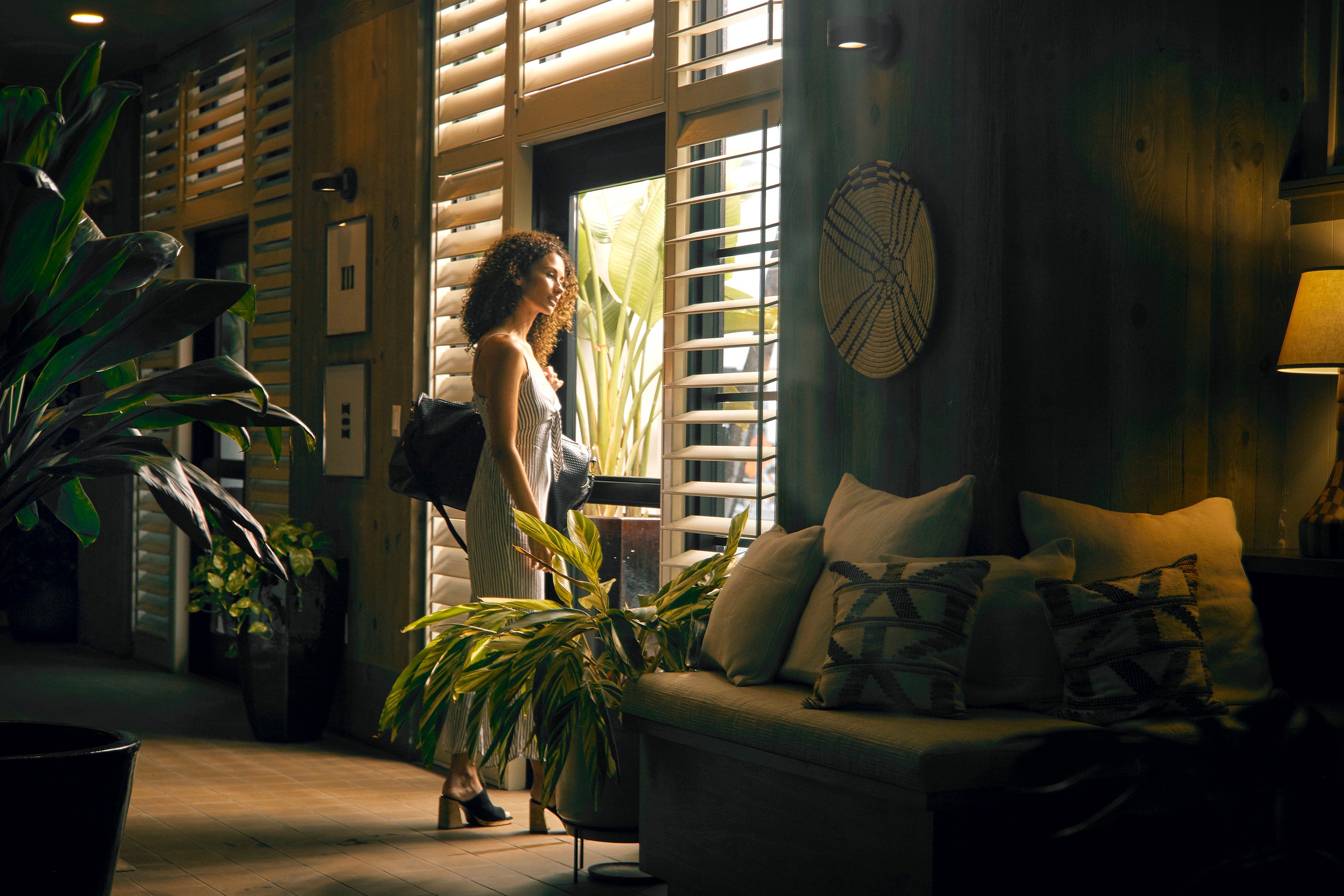
Create a self check-in experience that scales across multiple locations and is so smooth a guest never asks to speak to the manager.
By removing the traditional front desk, Life House lobbies feel more welcoming and less transactional. The kiosks also reduce wait times without adding staff – allowing the company to invest in the quality rather than quantity of their staff.
Design principals
Solution
Here’s how we did it
Motion design
Conclusion
More projects


Overview
About Life House
Life House is a chain of boutique hotels and a technology solution for hotel management. The brand is now operated by Lark Hotels.
My role
I was responsible for leading the design of both guest-facing products like the booking site and check-in kiosks, as well as back of house management tools to support them.
The goal
Create a self check-in experience that scales across multiple locations and is so smooth a guest never asks to speak to the manager.
By removing the traditional front desk, Life House lobbies feel more welcoming and less transactional. The kiosks also reduce wait times without adding staff – allowing the company to invest in the quality rather than quantity of their staff.
Design principals
Elegant but noticeable
Quick and conversational
Branded with scale in mind
Solution
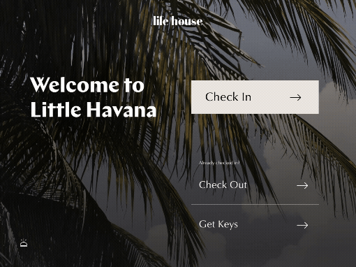
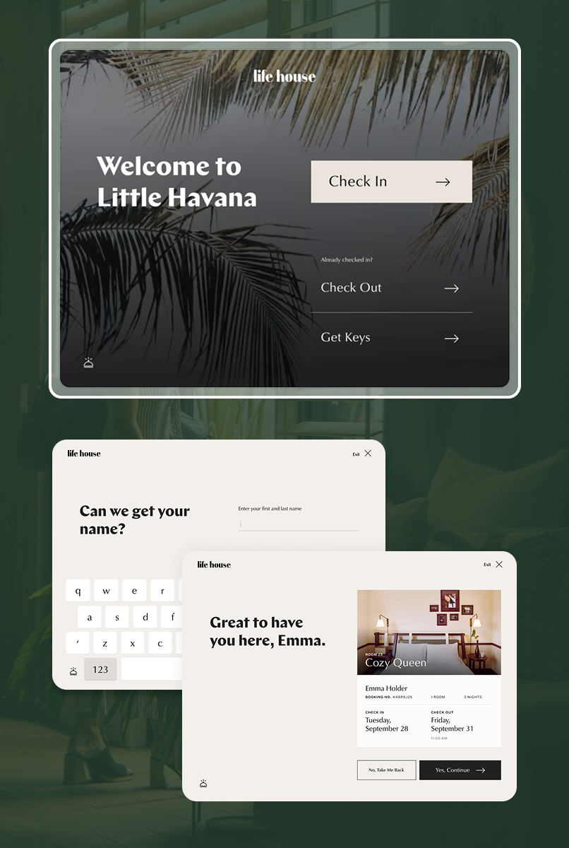
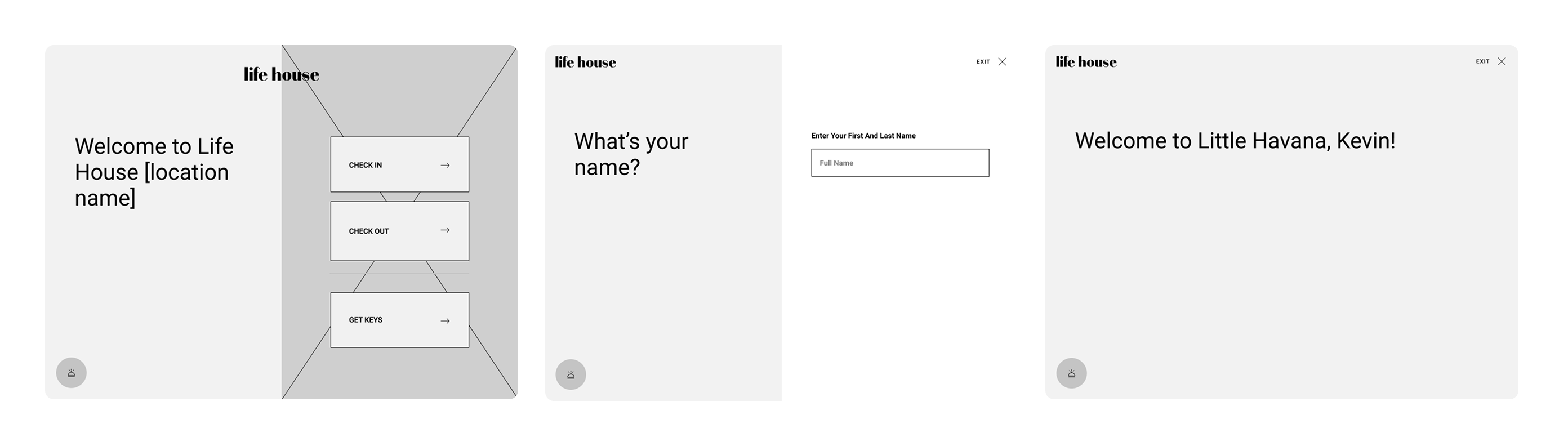
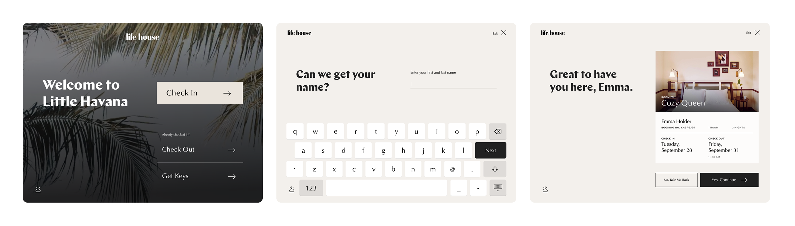
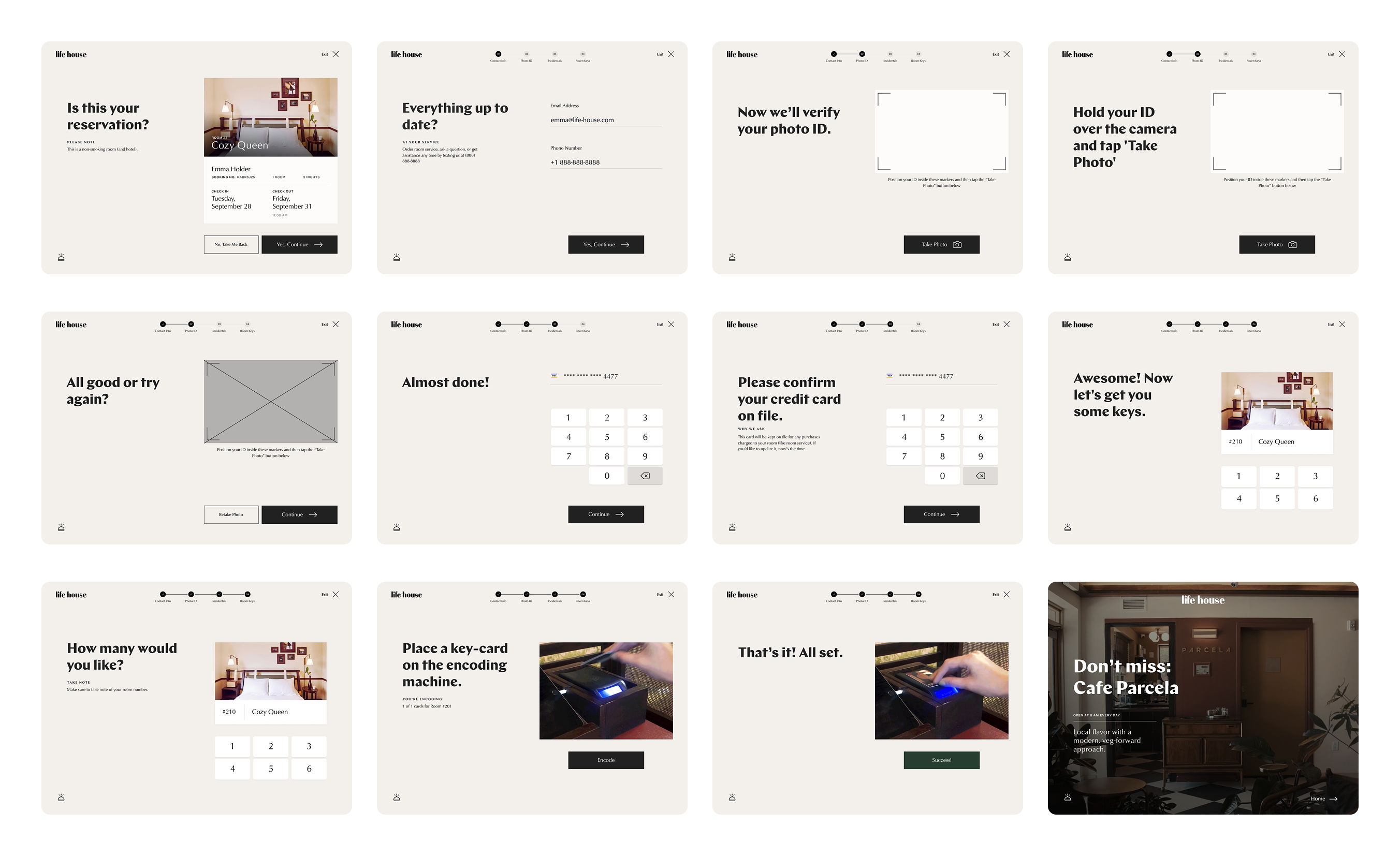
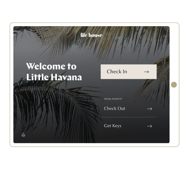
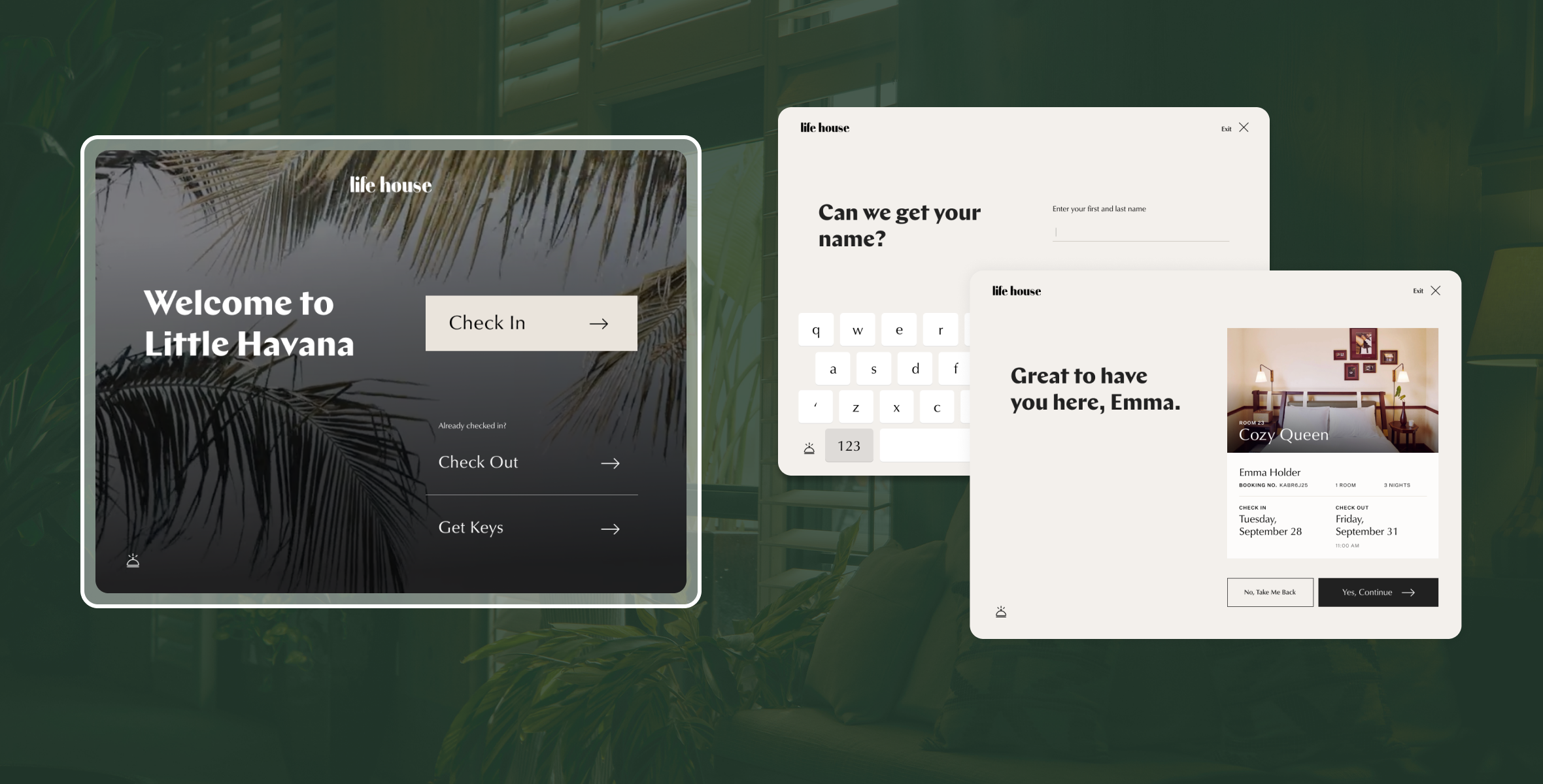
iPads placed in custom millwork, in alignment with each location’s distinct visual language, allow guests to check into their rooms and access keys (both digital and physical) quickly and efficiently.
Here’s how we did it
Content design
While the primary focus was enabling the user to check themselves in within a matter of minutes, a secondary objective was to ensure that this touchpoint didn’t feel too cold or impersonal. The check-in experience is an opportunity to set the tone for a guest’s stay, so infusing the interaction with touches of hospitality and a conversational tone became an important consideration.
Visual design
While the primary focus was enabling the user to check themselves in within a matter of minutes, a secondary objective was to ensure that this touchpoint didn’t feel too cold or impersonal. The check-in experience is an opportunity to set the tone for a guest’s stay, so infusing the interaction with touches of hospitality and a conversational tone became an important consideration.
Motion design
Conclusion
Used at 5 Life House locations at their peak, the self check-in experience was validated to be easy and quick by secret shopper review.
More projects
Emma Holder
About
Emma Holder
About
Overview
About Life House
Life House is a chain of boutique hotels and a technology solution for hotel management. The brand is now operated by Lark Hotels.
My role
I was responsible for leading the design of both guest-facing products like the booking site and check-in kiosks, as well as back of house management tools to support them.
The goal
Create a self check-in experience that scales across multiple locations and is so smooth a guest never asks to speak to the manager.
By removing the traditional front desk, Life House lobbies feel more welcoming and less transactional. The kiosks also reduce wait times without adding staff – allowing the company to invest in the quality rather than quantity of their staff.
Design principals
Elegant but noticeable
Quick and conversational
Branded with scale in mind
Solution
iPads placed in custom millwork, in alignment with each location’s distinct visual language, allow guests to check into their rooms and access keys (both digital and physical) quickly and efficiently.
Here’s how we did it
Content design
The check-in experience is an opportunity to set the tone for a guest’s stay, so while the primary focus was efficiency, we also wanted to ensure that the touchpoint didn’t feel too impersonal. To address this, we infused the interaction with touches of hospitality and a conversational tone.
Visual design
A neutral palette allows each location’s distinct personality to come through in the welcome screen and in minor accents throughout, giving a nice balance of consistency and individuality.
This visual system was later brought into the design strategy for each location’s website.
Motion design
Motion design adds a level of polish to the kiosk while also helping us achieve our design principals.
Guests entering the hotel are accustomed to looking for a front desk, not an iPad. This is taken into consideration in designing the physical space, but we also use the kiosk’s welcome screen to draw the eye. A looping video and cycling text is just enough motion to get attention while maintaining an elegant visual when up close.
We want the check in process to feel quick without losing sight of the welcoming tone we want to set. Text moves elegantly on and off screen and transitions aren’t slow, but they’re soft and never rushed.
Conclusion
Used at 5 Life House locations at their peak, the self check-in experience was validated to be easy and quick by secret shopper review.
More projects