Emma Holder
About

Overview
About Roofstock
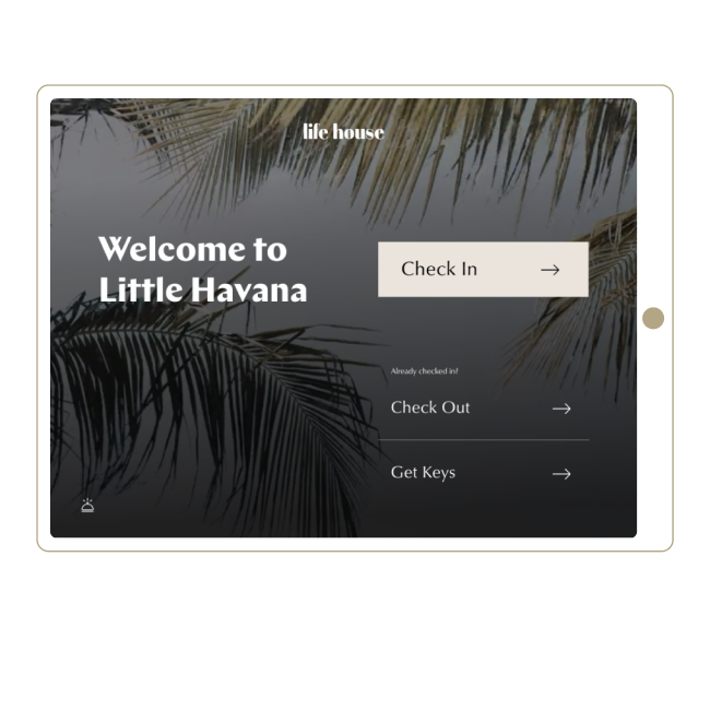
Roofstock is a data, analytics, and investment platform focused on the single-family rental sector (SFR). Stessa, a SaaS platform for self-service investors, is one of Roofstock’s consumer-facing products.
My role
I first began working on the design system as the lead designer on the Stessa team and have continued to lead the project as Head of Design.
Problem(s)
Solution
Process
A limiting color palette, no use of defined type styles, and un-bundled variants made the existing file confusing and cumbersome to work with
Based on past experience, I knew that some engineering teams had difficulty customizing MUI libraries, and speaking with Stessa’s engineers confirmed that this was their experience as well.
While customization is not always the most important, I believed that Stessa was too established as a brand to lean on a generic UI. If we didn’t change tack now, we’d only be delaying the inevitable replacement of MUI down the line.
I proposed a change in direction from the MUI library to a custom-built design system paired with Storybook implementation. Leadership trusted my input and the experience of engineering leadership, giving us lattitude to implement our vision.
Conclusion
More projects

Emma Holder
About
Overview
About Roofstock
Roofstock is a data, analytics, and investment platform focused on the single-family rental sector (SFR). Stessa, a SaaS platform for self-service investors, is one of Roofstock’s consumer-facing products.
My role
I first began working on the design system as the lead designer on the Stessa team and have continued to lead the project as Head of Design.
Problem(s)
Inconsistent ownership and little oversight left Stessa with an incomplete, nondescript, and difficult to use design system.
When I began working with the Stessa team, I inherited a work-in-progress design system file and front-end repo based on Google’s MUI. I quickly identified the following key issues:
- Components in Figma were built without the designer experience in mind, with unclear naming patterns, un-bundled states, and over-engineered foundation elements
- MUI components are difficult to customize in code, which severely limits the scope of design and gives the platform a generic feel with no room to grow
- Lack of project oversight and governance meant little documentation and no continuity between design and engineering
Solution
A custom design system utilizing variable libraries, matching Storybook instance, and governance documentation.
Process
Vision & Alignment
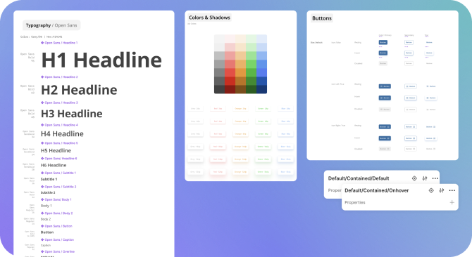
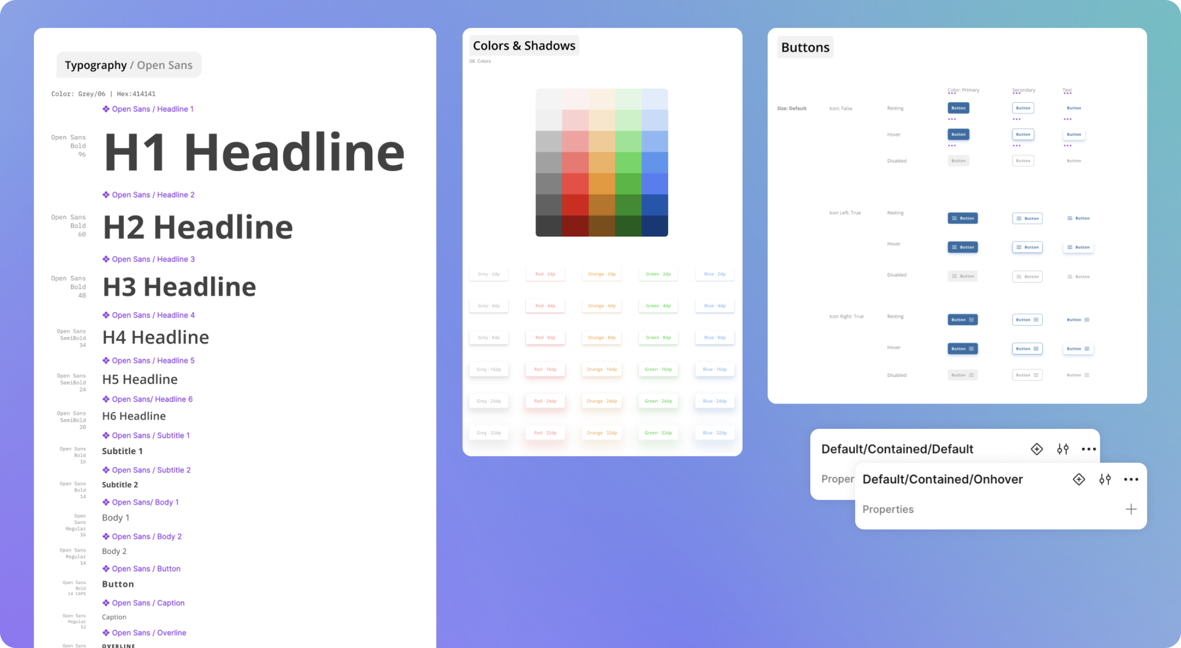
When I began working with Stessa, the team had just started to build features using a design system based on MUI; the Figma file had been put together by a contractor with little oversight and the engineering team was using MUI out of the box. Diving into the Figma files, it became clear that my experience as a designer would suffer from using the file. Foundational styles such as text and drop shadows had been made into components rather than styles, and standard components like buttons didn’t utilize properties to document states or variants.
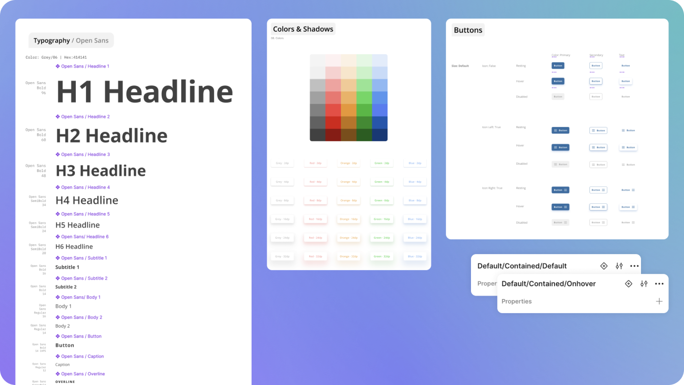
A limiting color palette, no use of defined type styles, and un-bundled variants made the existing file confusing and cumbersome to work with
Based on past experience, I knew that some engineering teams had difficulty customizing MUI libraries, and speaking with Stessa’s engineers confirmed that this was their experience as well.
While customization is not always the most important, I believed that Stessa was too established as a brand to lean on a generic UI. If we didn’t change tack now, we’d only be delaying the inevitable replacement of MUI down the line.
I proposed a change in direction from the MUI library to a custom-built design system paired with Storybook implementation. Leadership trusted my input and the experience of engineering leadership, giving us lattitude to implement our vision.
Strategy
We paused work on the MUI design system immediately and I got to work. I audited Stessa’s app to identify the most important components and then checked my list against the MUI file to understand where we might be able to use components and where we’d need to build from scratch. Working with an experienced front-end engineer, I put together a roadmap to launch the custom design system in 4 months.
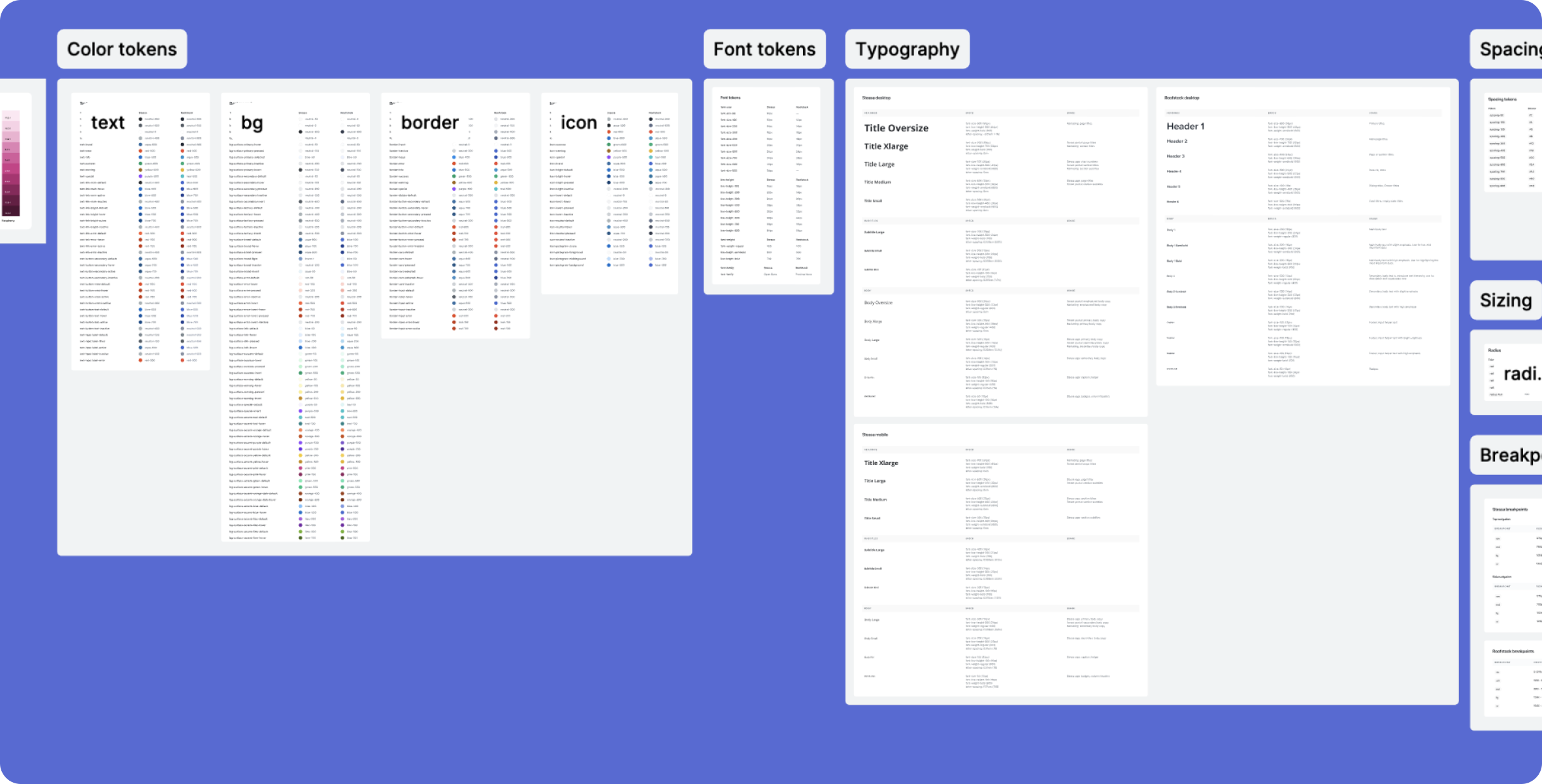
Though Figma had not yet released variables natively, tokens were already widely used by engineering teams. I gained an understanding of the timing trade-offs of building a themable design system using tokens Taking into account Stessa’s two audiences (investors and renters) and the additional brands under the Roofstock name,
My engineer wisely suggested we build this functionality into our library, taking into account that Stessa has two audiences (investors and renters) and the UIs for each were bound to differ.
Given that Stessa is just one of Roofstock’s brands, this sounded like a worthy investment to me, and we envisioned that our work could be used across other parts of the company simply by adding new themes.
Design implementation
Working with two designers, we got started on our highest priority components. In order to preserve consistency across the app, we aligned on maintaining most of the visual language in the MUI library. Generally speaking we mimicked stroke weight, corner radius, color, and sizing, but went against the standard for interaction elements like hover states. This strategy would allow us to keep a cohesive design across the app in the near-term while setting us up for a more differentiated UI in the future.
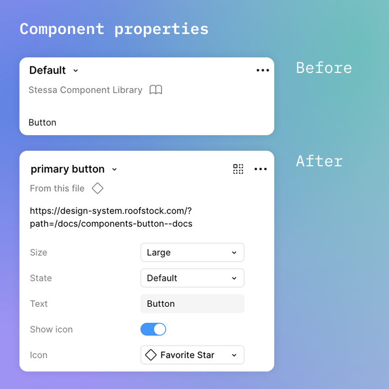
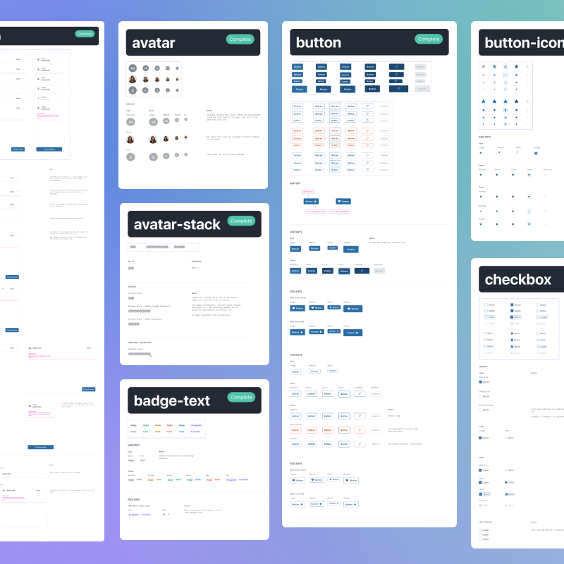
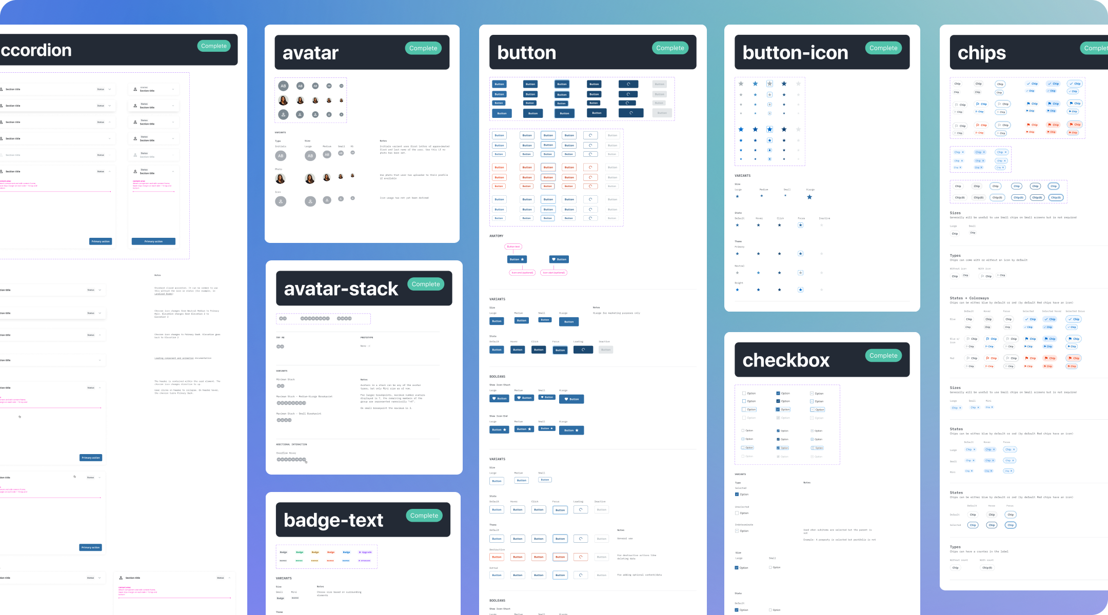
In building out components, I made use of Figma’s variants and nested basic components within others for a modular approach.
In building out components, I made use of Figma’s variants and nested basic components within others for a modular approach. Both designers on my team were rather new to design system work, so we spent time going over tutorials, strategies, and best practices together. Later I’d assign components for each to work on and we’d review their solutions at regular crit meetings or problem-solve together during co-working sessions.
Adding Variables
We launched a set of most-used components within our 4-month timeline, including themeing capabilities in Storybook.
Later that year when Figma did release variables, we implemented them on the design side as well. Now we have one library that is utilized across two applications, with plans for extending its usage to additional brands.
Operations and governance
In addition to the tactical work, I spent time refining the documentation for each component to include purpose, use notes, and properties. I outlined design principals, general best practices, and contribution guidelines for my team. We made space for ongoing check-ins with engineering to discuss needed updates or additions to the library.
Conclusion
Though the amount of bandwidth our team has to spend on design systems has ebbed and flowed over time, we’ve consistently maintained the library and the business continues to see value in our up-front effort. Having the flexibility of a variable-backed design system has repeatedly proved to be a head-start when taking on new initiatives.
More projects
Emma Holder
About
Overview
About Roofstock
Roofstock is a data, analytics, and investment platform focused on the single-family rental sector (SFR). Stessa, a SaaS platform for self-service investors, is one of Roofstock’s consumer-facing products.
My role
I first began working on the design system as the lead designer on the Stessa team and have continued to lead the project as Head of Design.
Problem(s)
Inconsistent ownership and little oversight left Stessa with an incomplete, nondescript, and difficult to use design system.
When I began working with the Stessa team, I inherited a work-in-progress design system file and front-end repo based on Google’s MUI. I quickly identified the following key issues:
- Components in Figma were built without the designer experience in mind, with unclear naming patterns, un-bundled states, and over-engineered foundation elements
- MUI components are difficult to customize in code, which severely limits the scope of design and gives the platform a generic feel with no room to grow
- Lack of project oversight and governance meant little documentation and no continuity between design and engineering
Solution
A custom design system utilizing variable libraries, matching Storybook instance, and governance documentation.
Process
Vision & Alignment
When I began working with Stessa, the team had just started to build features using a design system based on MUI; the Figma file had been put together by a contractor with little oversight and the engineering team was using MUI out of the box. Diving into the Figma files, it became clear that my experience as a designer would suffer from using the file. Foundational styles such as text and drop shadows had been made into components rather than styles, and standard components like buttons didn’t utilize properties to document states or variants.
A limiting color palette, no use of defined type styles, and un-bundled variants made the existing file confusing and cumbersome to work with
Based on past experience, I knew that some engineering teams had difficulty customizing MUI libraries, and speaking with Stessa’s engineers confirmed that this was their experience as well.
While customization is not always the most important, I believed that Stessa was too established as a brand to lean on a generic UI. If we didn’t change tack now, we’d only be delaying the inevitable replacement of MUI down the line.
I proposed a change in direction from the MUI library to a custom-built design system paired with Storybook implementation. Leadership trusted my input and the experience of engineering leadership, giving us latitude to implement the vision.
Strategy
We paused work on the MUI design system while I audited Stessa’s app to identify the most important components to rebuild. I then checked my list against the MUI file to understand where we might be able to use components and where we’d need to build from scratch. Working with an experienced front-end engineer, I put together a roadmap to launch the custom design system in 4 months.
Taking into account Stessa’s two audiences (investors and renters) and the additional brands under the Roofstock name, I became interested in building theming capabilities into our new system. Though Figma had not yet released variables natively, tokens were already widely used by engineering teams and I worked with my engineer to gain an understanding of the trade-offs involved. Ultimately, we were able to add this feature on the engineering side with little impact to the roadmap.
Design implementation
Working with two designers, we got started on our highest priority components. In order to preserve consistency across the app, we aligned on maintaining most of the visual language in the MUI library. Generally speaking we mimicked stroke weight, corner radius, color, and sizing, but went against the standard for interaction elements like hover states. This strategy would allow us to keep a cohesive design across the app in the near-term while setting us up for a more differentiated UI in the future.
In building out components, I made use of Figma’s variants and nested basic components within others for a modular approach. Both designers on my team were rather new to design system work, so we spent time going over tutorials, strategies, and best practices together. Later I’d assign components for each to work on and we’d review their solutions at regular crit meetings or problem-solve together during co-working sessions.
Adding Variables
We launched a set of most-used components within our 4-month timeline, including theming capabilities in Storybook.
When Figma released variables support the next year, we implemented them on the design side as well. Now we have one library that is utilized across two applications, with plans for extending its usage to additional brands.
Operations and governance
In addition to the tactical work, I spent time refining the documentation for each component to include purpose, use notes, and properties. I outlined design principals, general best practices, and contribution guidelines for my team. We made space for ongoing check-ins with engineering to discuss needed updates or additions to the library.
Conclusion
Though the amount of bandwidth our team has to spend on design systems has ebbed and flowed over time, we’ve consistently maintained the library and the business continues to see value in our up-front effort. Having the flexibility of a variable-backed design system has repeatedly proved to be a head-start when taking on new initiatives.
More projects