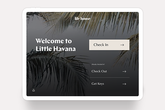
Self Check In
(Life House Hotels)
User Experience
Visual Design
Motion Design
All images courtesy of Life House
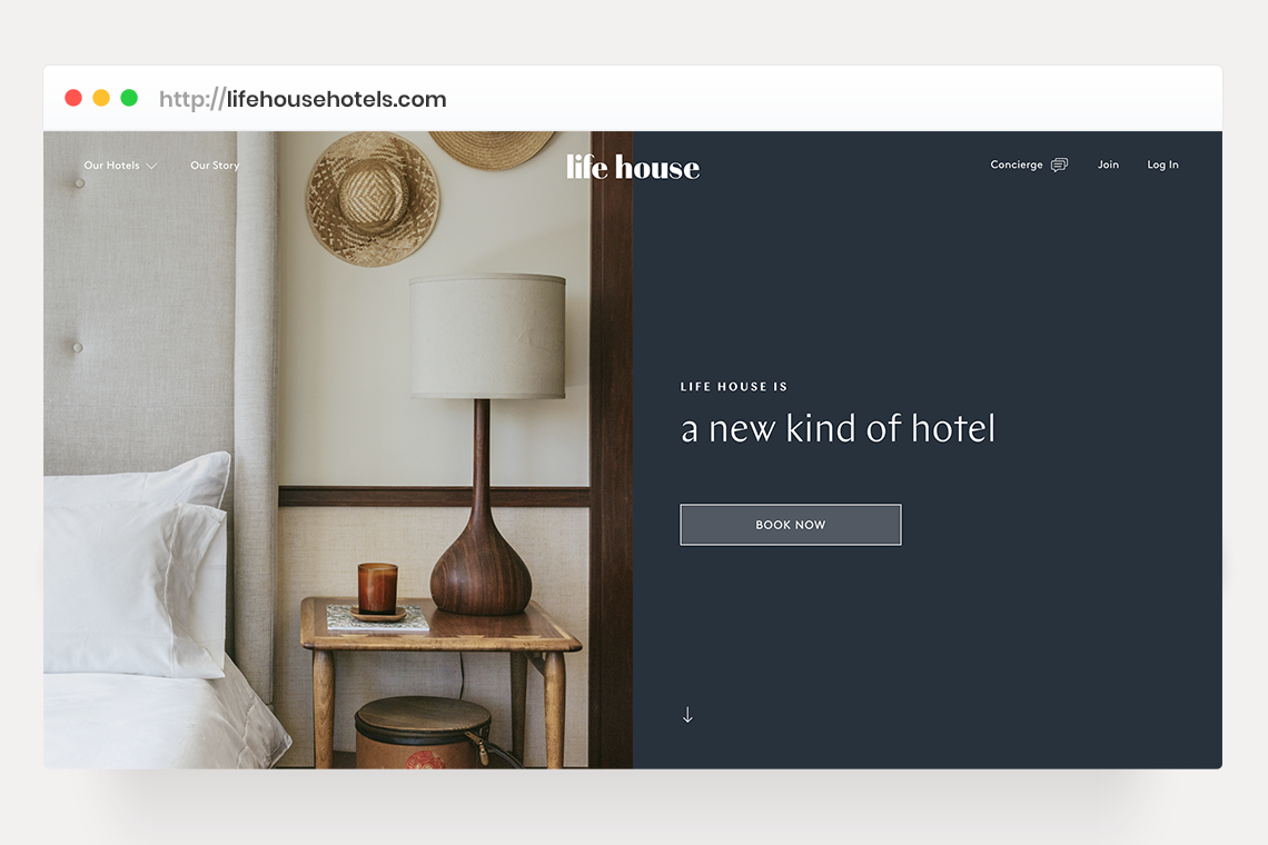
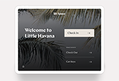
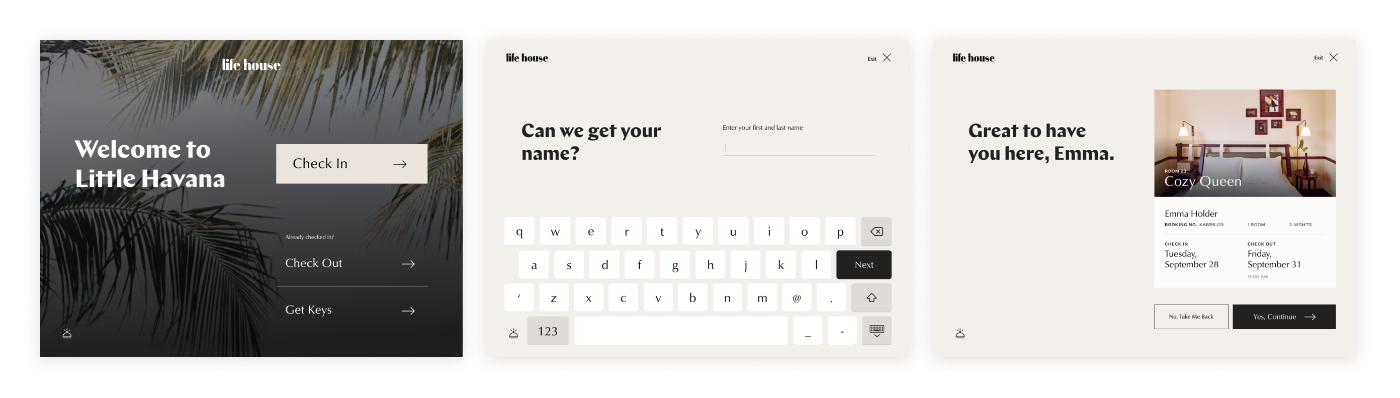
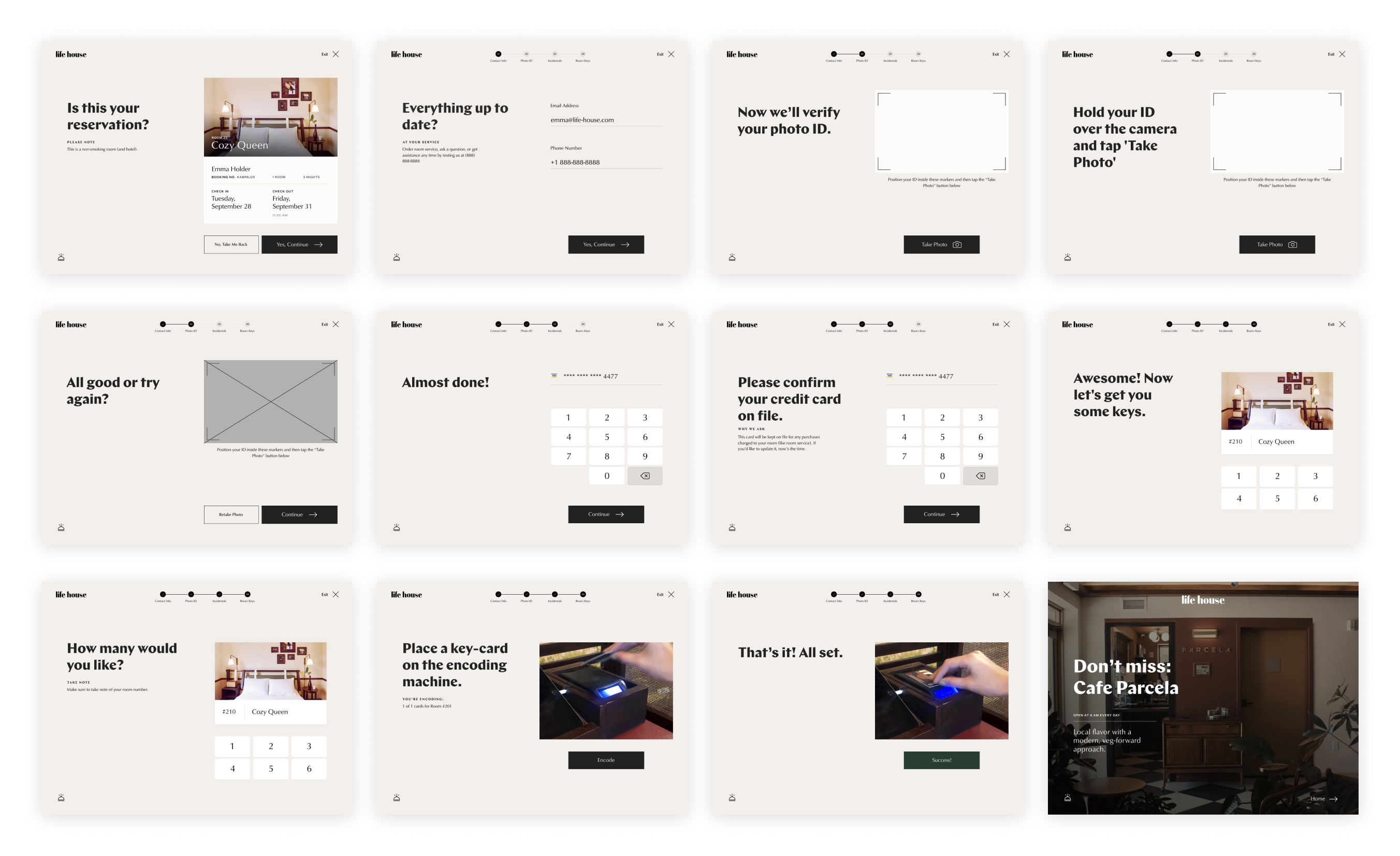
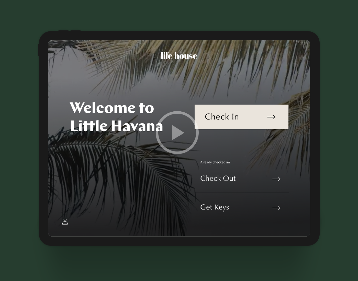
From the beginning, Life House has made a practice of questioning traditional hotel processes, leveraging technology to optimize where possible. One area we’ve chosen to invest in is the check-in process; Life House guests are encouraged to use self check-in kiosks (iPads placed in custom millwork) where they can check into their rooms and get keys quickly and autonomously.
By removing the traditional front desk, Life House lobbies feel more welcoming and less transactional. The kiosks also reduce wait times without adding staff – allowing us as a company to invest in the quality rather than quantity of our people.
USER EXPERIENCE
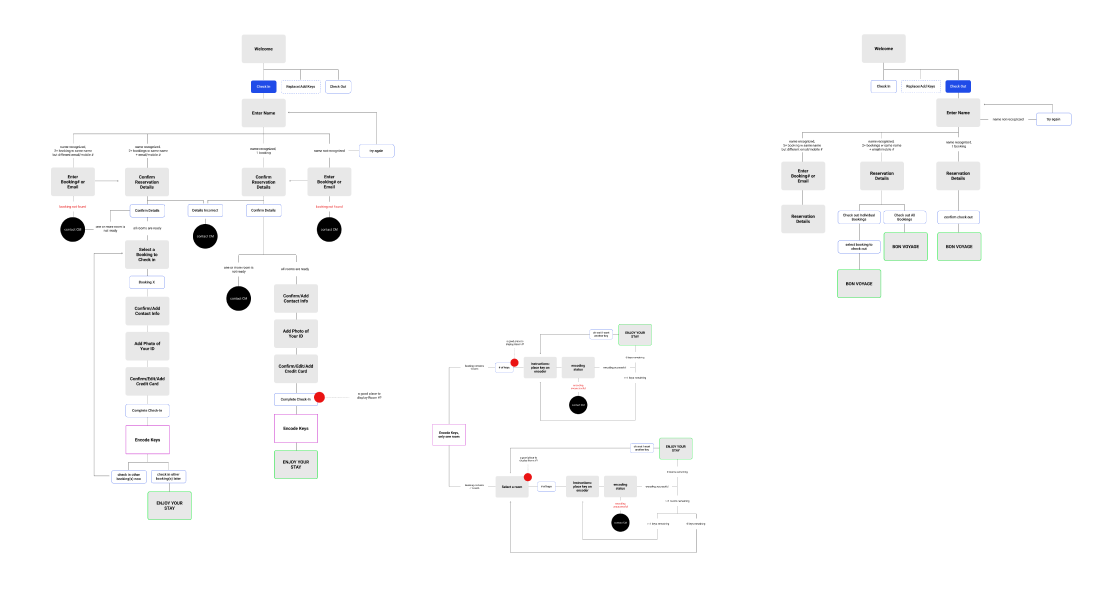
User journey maps for the check in, check out, and encoding keys interactions.
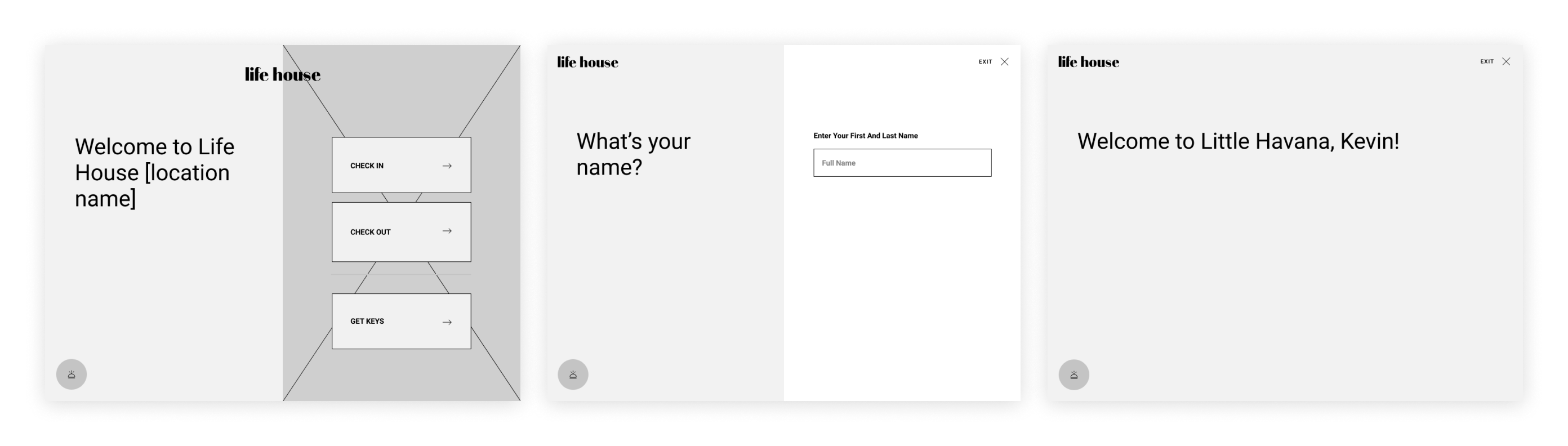
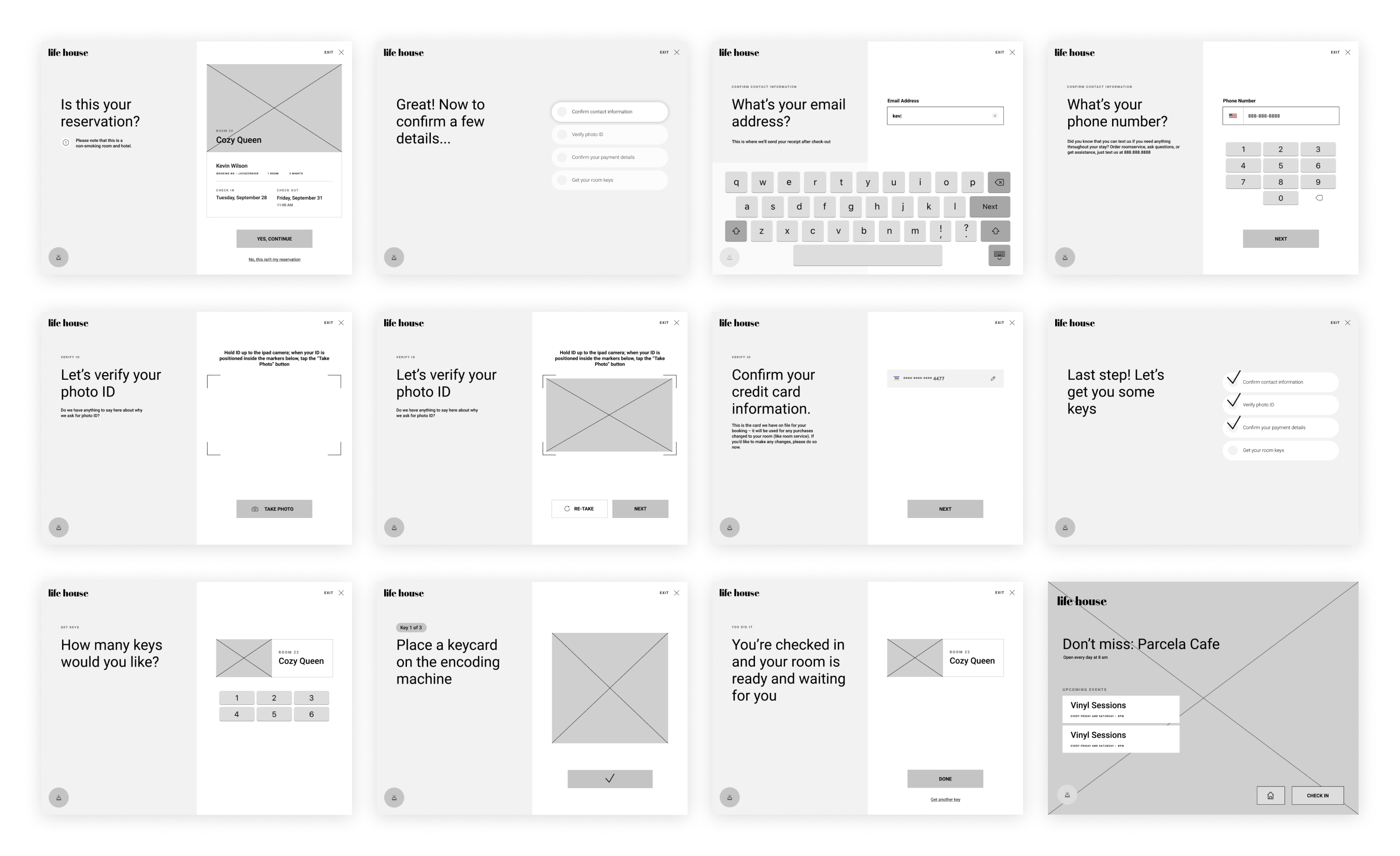
WIREFRAMES
While the primary focus was enabling the user to check themselves in within a matter of minutes, a secondary objective was to ensure that this touchpoint didn’t feel too cold or impersonal. The check-in experience is an opportunity to set the tone for a guest’s stay, so infusing the interaction with touches of hospitality and a conversational tone became an important consideration.
VISUAL DESIGN
At the time this project kicked off, Life House’s brand guidelines were still in a bit of flux. We took the kiosk design as an opportunity to update and elevate the visual language with the intention of rolling those updates out across the the website at a later date.
We chose Classico as the primary typeface and use Untitled Sans and Chap sparingly. We also stick to a neutral palette for much of the experience, allowing room for each property’s personality to come through at the beginning and end of the interaction. This system allows us to utilize the kiosk in each of our individual hotels with a nice balance of consistancy and individuality.
MOTION DESIGN
Motion design not only adds a level of polish to the guest kiosk, but helps us achieve two important objectives:
Draw attention –
Guests entering the hotel are accustomed to looking for a front desk, not an iPad. We take this into consideration when designing the physical spaces, but rely on motion to draw a guest’s eye even more. A looping video and cycling text on the home screen is just enough motion to get attention while maintaining an elegant visual up close.
Quick but conversational –
We want the check in process to feel quick without losing sight of the welcoming tone we want to set. Text moves elegantly on and off screen and transitions aren’t slow but they’re soft and never rushed.
More Projects